Inbank - Financial Platforms

Governing decisions, not just components

Duration

12 months +

Made with

Industry

Home Banking

A design system is not just a collection of components. It is the set of decisions that allows a product to remain coherent while it grows, changes, and is shaped by multiple teams. This project shows how the Inbank design system was used as a way to govern complexity, going beyond UI kits and tokens to include decision-making criteria, shared principles, and alignment across teams and platforms.

Context

Inbank is a home banking and trading platform serving a wide and diverse user base, with high requirements in terms of reliability, clarity, and trust. The product ecosystem spans multiple platforms, including iOS, Android, and web, and supports complex financial operations. Over time, multiple teams worked in parallel on different features and products, each with its own priorities and timelines. While individual interfaces worked well locally, overall coherence increasingly depended on personal experience and informal knowledge rather than on a shared structure.

The real problem

The core issue was not the lack of components, but the dispersion of decisions.

Many UX and UI choices were implicit, passed on verbally, or applied through habit. This made it difficult to maintain consistency across products and platforms, onboard new designers and developers, evolve the system without reintroducing fragmentation, and discuss design decisions in an objective and reusable way.

The risk was that the design system would become a static catalog, unable to support the product’s evolution over time.

My Role

I worked as a Senior UI Designer, contributing to the definition and evolution of the Inbank design system.

My role extended beyond designing components. A significant part of my work focused on structuring decisions: clarifying what belonged to the system, what did not, and why. I collaborated closely with UX designers, developers, and stakeholders to make criteria, rules, and trade-offs explicit, transforming tacit knowledge into shared and durable references.

Governing conflicts through shared decisions

Rather than enforcing a single system upfront, the work focused on making differences visible and discussable.
Workshops were used as a decision-making tool to surface implicit assumptions across teams. Instead of reviewing screens or components, sessions centered on questions such as which decisions needed to be global, which could remain contextual, and where divergence was actually valuable.

Rather than enforcing a single system upfront, the work focused on making differences visible and discussable.

Workshops were used as a decision-making tool to surface implicit assumptions across teams. Instead of reviewing screens or components, sessions centered on questions such as which decisions needed to be global, which could remain contextual, and where divergence was actually valuable.

These conversations shifted the focus from visual preferences to system behavior, ownership, and long-term impact. Conflicting patterns were not immediately unified, but traced back to the decisions that generated them. This made it possible to identify common ground without erasing legitimate differences.

The outcome was not consensus by compromise, but a clearer decision structure that allowed previously separate design systems to converge into a shared foundation.

Obsolete and disheartening Android configuration

The primary challenge was aligning the design across three distinct platforms, each with its own set of guidelines and user expectations. Additionally, coordinating between separate teams for web and mobile development required effective communication and collaboration.

These conversations shifted the focus from visual preferences to system behavior, ownership, and long-term impact. Conflicting patterns were not immediately unified, but traced back to the decisions that generated them. This made it possible to identify common ground without erasing legitimate differences.

The outcome was not consensus by compromise, but a clearer decision structure that allowed previously separate design systems to converge into a shared foundation.

Allitude

Product Owner

Dimension 

Head of Development 

Tangible

Head of Design

Allitude

Internal Design Team

Tangible

Design Team

Dimension

App Development Team

Pigmento

Front-end Team

Evoq

Creative Director

What changed

Design discussions became less about negotiation and more about decisions. Teams shared a common language to reason about interfaces, onboarding required less context transfer, and feature delivery relied less on ad-hoc alignment. The design system did not remove complexity, but it transformed it from a source of friction into a manageable, shared structure.

Reflection

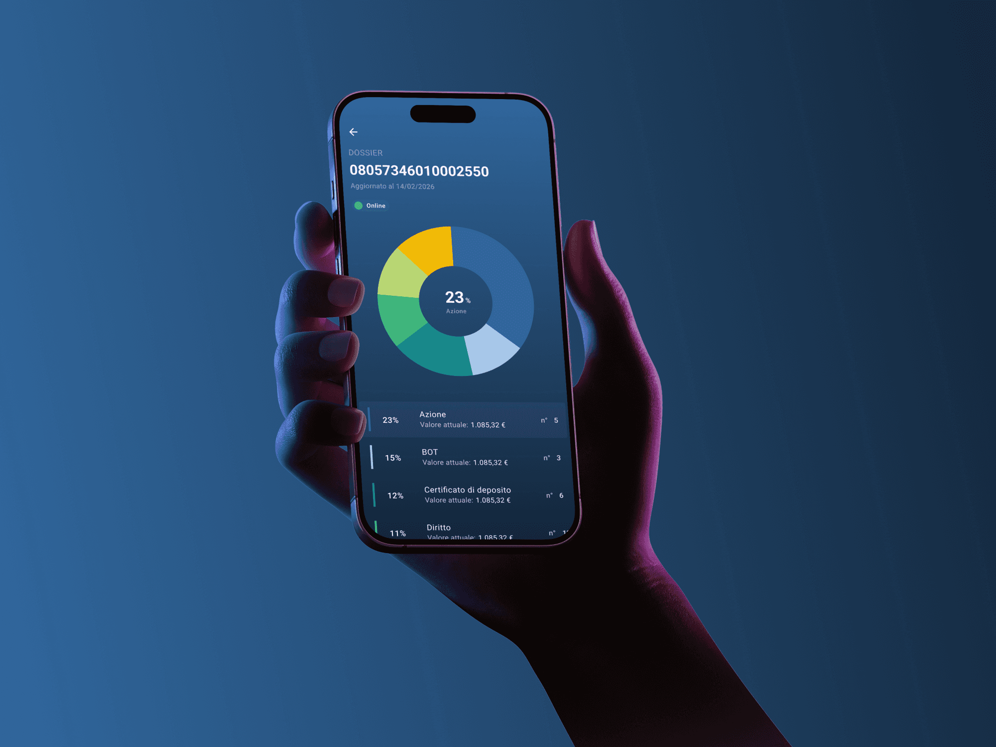
A more intuitive, efficient, and visually coherent banking experience, reducing complexity while enhancing usability. The integration of design tokens and a structured design system enables long-term adaptability and seamless platform evolution.

E.

Currently available for product design roles
and system-driven projects on complex digital products.
If this way of thinking resonates, lets discuss a product.

© Edoardo Sportelli - 2026. Living in Italy, in Fiastra, nestled in the Sibillini Mountains. Like Tuscany, but better. Policy Privacy and Data Protection. No reuse or redistribution without permission.

Currently available for product design roles
and system-driven projects on complex digital products.
If this way of thinking resonates, let’s discuss a product.

© Edoardo Sportelli - 2024
Living in Italy, in Fiastra, nestled in the Sibillini Mountains. Like Tuscany, but better.

Policy Privacy and Data Protection.

No reuse or redistribution without permission.

E.