
Outcome
Concept
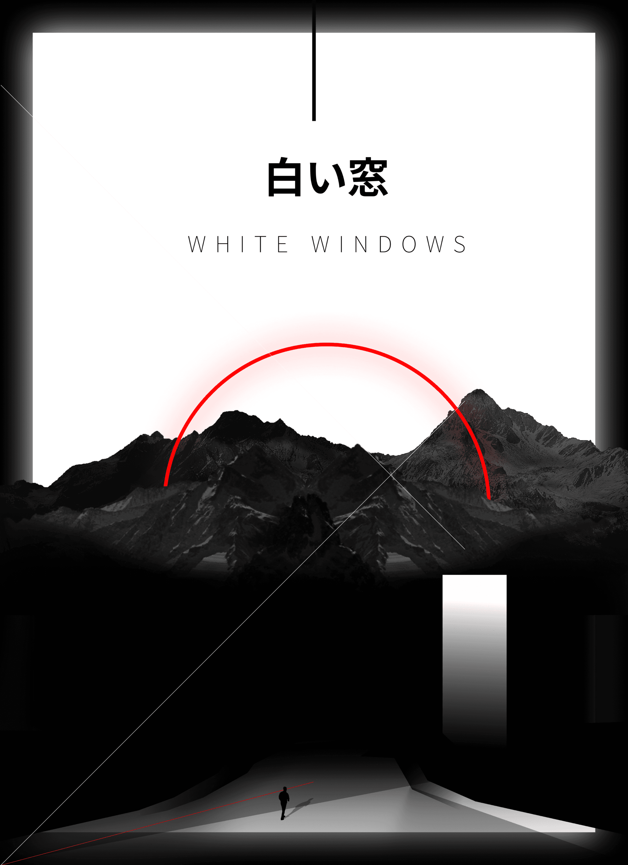
The initial concept for this HMI UI design project was inspired by a futuristic cyberpunk landscape that blends minimalism with cutting-edge technology. Drawing from the neon-lit, high-tech aesthetics of cyberpunk, the design aims to create a visually striking yet user-friendly interface that immerses the driver in a futuristic environment. The challenge was to balance dynamic, high-tech visuals with the practicality required in a car dashboard, ensuring all vital information was immediately accessible without overwhelming the user.
From Visual Exploration to 3D Renderings
The visual exploration focused on blending neon gradients with dark backgrounds, experimenting with light effects to convey the vehicle's advanced technology. 3D renderings simulated reflective surfaces and dynamic lighting to set the tone for the final screens.

Convergence in the final style
The design elements converged into a cohesive visual style, blending sleek neon lighting, dynamic gradients, and modern typography. Consistency was key, with each screen seamlessly integrating into the overall aesthetic, ensuring a balanced, user-friendly experience. The interface now exudes both advanced technology and a futuristic ambiance, aligning perfectly with the vehicle's identity.


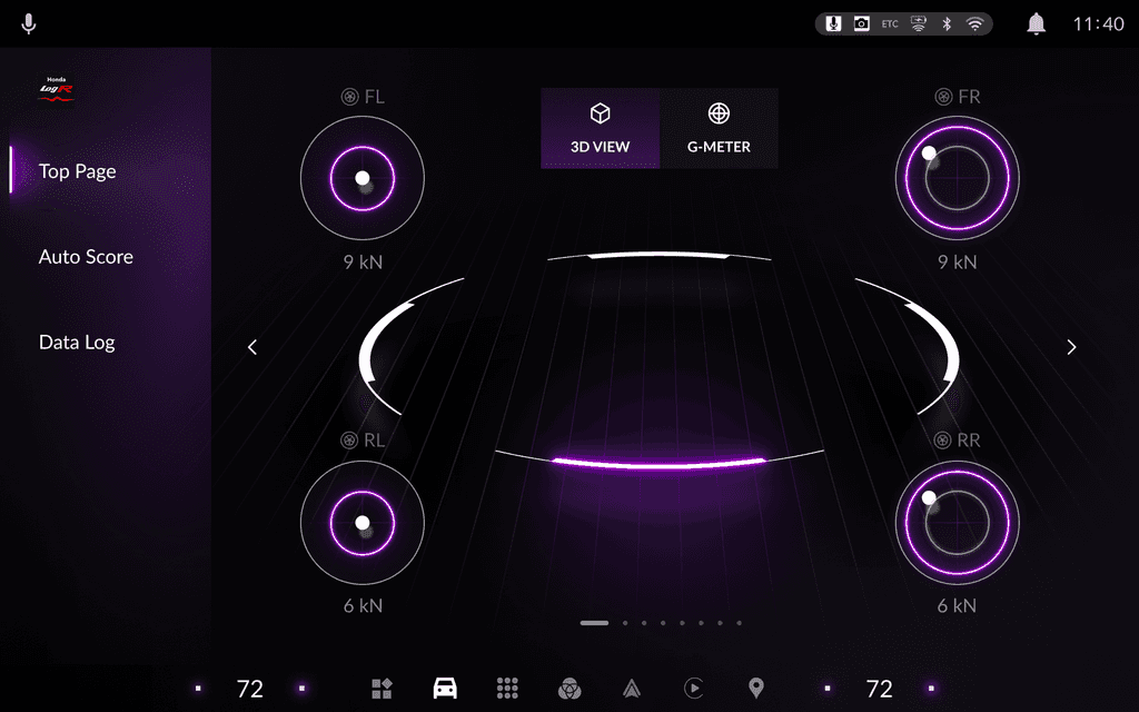
Designing Final Screens
The final interface was crafted with a focus on key driving metrics, such as speed, charge percentage, and power usage. The layout was streamlined, with information positioned for easy access and readability. Interactive elements and subtle animations were introduced to enhance user engagement, ensuring a clean, modern aesthetic while maintaining usability.


Design Token System for Honda and Acura
In collaboration with Honda, we embarked on a six-month pilot project to create a comprehensive design token system. This initiative focused on two primary touchpoints: the Central Information Display (CID) and the Instrument Cluster (IC). The goal was to design a unified yet flexible system that would accommodate both Honda's and Acura’s brand identities while maintaining consistency across shared elements.
Design Tokens
The primary goal was to establish a design token framework that encapsulated both the visual and interactive elements of Honda and Acura. The framework aimed to streamline the design and development processes for both brands, ensuring a cohesive user experience across their respective infotainment systems. By creating a shared system of tokens (such as colors, typography, layout specifications), the design language could be easily scaled and customized according to each brand’s identity.
Taxonomy
We introduced a design token taxonomy to structure and categorize the components of the system. This taxonomy was vital for organizing design tokens in a structured and scalable way. The components were categorized into three main layers:
Global: Tokens that applied across both Honda and Acura (e.g., typography, core colors).
Unique: Brand-specific tokens (e.g., layout, component styles) that reflected the individual identities of each brand.
Fundamental: Essential documentation, including naming conventions, for easy maintenance and clarity.
This taxonomy helped ensure that each token was properly categorized for efficient use and future scalability.

Challenges
While developing this system, we encountered several challenges:
Brand Customization: We had to find the right balance in adapting the tokens to suit the unique needs of both Honda and Acura, while still maintaining an overall consistent design framework.
Component Hierarchy: Clear naming conventions and categorization were necessary for the effective organization of design tokens.
Global vs. Unique Tokens: Striking the right balance between global shared elements (such as typography) and brand-specific components was key to maintaining individuality for both brands.
File Management: Ensuring an organized structure for Figma files and managing version control was crucial to keep the system streamlined.
Cross-Platform Compatibility: Ensuring that design tokens worked seamlessly across different platforms, ensuring consistency in the experience no matter the device.
A well-structured taxonomy was critical to managing the complexity of the design system effectively. It provided clarity in how design tokens were categorized, named, and organized, allowing for better collaboration across teams and enabling future growth of the system.
Design Token Naming Convention
As part of our work with Honda and Acura, we established a design token naming convention to ensure clarity, consistency, and scalability across the system. The naming format follows a structured and hierarchical approach, enabling seamless updates, easy component identification, and efficient collaboration. Below is the format used for naming design tokens:
Naming Format:
[Category] / [Component List] / [Type] / [Variant] / [State] / [Theme]
The design token name for "Actions / Button / Primary / Hover / Dark" would follow the naming convention and look like this:
ACT/Button/Primary/Hover/Dark
Explanation:
ACT: Prefix for Actions (representing the category)
Button: Component list (button element)
Primary: Type (primary style)
Hover: State (hover effect)
Dark: Theme (dark mode variant)